Tuesday, December 11, 2007
Design Research
To view my design research please visit hannasdesignresearch.blogspot.com! It was pretty interesting to see all thats out there in the world of design!
Monday, December 10, 2007

Tuesday, November 20, 2007


Best of Ching
 I like this one because I enjoy using the white pencil on black paper to change things up...this is a drawing of elmer's glue and Lauren's project.
 This one I did in pencil and I think I did a nice job.
Le Corbuiser Sketches
 I love how this drawing turned out! See Stoel I even used the darkest of the darks on this one!
Thursday, November 1, 2007
Practice Never Hurts!
 I think these forms were fun to do and were my favorite both in pen and pencil! It's cool how we I combined all three shading techniques on the same form, it really gives it great depth and makes it very unique!! Pretty cool huh?
 On these exercises from the book we used pencil to use hatching, crosshatching, squiggle and smudge to shade in these shapes...I did a few extra because practice, practice, practice will hopefully pay off for me! I think the polygons turned out the best out of these...
These are some shapes done in pen, I actually prefer to use pencil for these exercises!
Tuesday, October 30, 2007
IARC is everywhere!!
 After the Ai3 speech on Wednesday we all went out to dinner to Phoenix Asian Cuisine..and it was really yummy! Anyhow, after I got a take out box and we were sitting around talking I started to doodle on my box and thought hey....practice everywhere! And check it out...diagonal, crosshatching and random shading on my box!! I thought it was pretty cool and everyone said...put it on your blog!! Me, Melia, Zach, Katrina, Karis, Anna, Sara & Ben A. all ate together....fun, fun, fun!
Tut Tut it Looks Like Fall
 Being from Florida I've never experienced the seasons changing really, the cold winters or the leaves all changing colors...it's beautiful to drive down the street and see all the yellows, oranges, reds and greens in the leaves. This is just a drawing for fall, nothing special...
Shading it up!
 So we started something new and fun today...shading!! They taught us different ways of shading and set up this composition in class for us to draw. We were to focus on the different values and take note of where the light hits the objects and make those spaces lighter. I like how this turned out, although I think I should have used some darker values. The shading method I used here was the diagonal lines.
 This shading is of a clover patch I found outside my apartment....I thought they were all so beautiful and unique in their own way so I tried to capture them using different values and shading them in. I used the smudge and diagonal method on this one mostly. However, in person you can really see all the different values better. Overall I think these are pretty good and I'm looking forward to shading more and more!
Thursday, October 11, 2007
From Pencils to Petals: Metamorphosis Project

 Here are some photos that really let you see the change! I think when you put them side by side you can see how they warp into different forms and in the end I feel like I really showed the metamorphosis of their projects.
 This next step was the hardest for me...how can I take my middle example and make it more like Hannah's without being exactly like her project?? I decided to keep the textured paper throughout the metamorphosis. However, instead of a mat board base I chose to use cardboard like Hannah did. I made and egg like shape (like Hannah's) but left one edge of the shape a corner, to still represent a part of Eriko's box. On the corner part I included a few petals with the red and black from Eriko's project. As far as the rest of the petals, I left them natural colored and weaved them through the bottom like Hannah did in her project.

 Petals, Petals everywhere! So this is the prototype that became my in-between project. I still used the rectangular shape of the box as my base, mat board and the textured paper from Eriko's box, but included many more petals from Hannah's project and used the colors from both. I think this one seems even more open and is a good medium for both.
 corner view, love the textured paper!
 petals seen on one side...
 So here are some shots of my first iteration...I took the textured paper, shape, and black mat board used in the pencil box and mixed it in with the petals from the egg project, which I did in both the natural color Hannah used and the red and black from Eriko's box. I also used cardboard for the sides since Hannah used cardboard for her base. I wanted it to feel open and I think I did a nice job of it. However, after the first critique we determined that because of the shape, texture and color this example leans more towards Eriko's than Hannah's, so I had to come up with another "middle" example.


 Metamorphosis: a complete change of form, structure, or substance (www.dictionary.com) hmm...so we are supposed to take two projects completed by our classmates and show we we take a little from each and mix them together...this is a lot easier than it sounds! The above pictures are the two projects I chose...Eriko's pencil box, and Hannah Coble's egg project...I like the colors used in Eriko's box and the simplicity of her design. With Hannah's I appreciate the natural feel it has and the way it shows the shape of the egg. To combine them I noticed that they are both very open and neither of them have a lid, so that was the quality I chose for my first iteration.
Tuesday, October 9, 2007
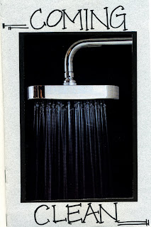
Coming Clean...Zine Layout 1st Edition
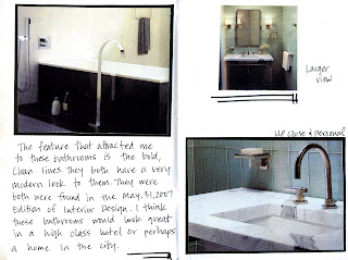
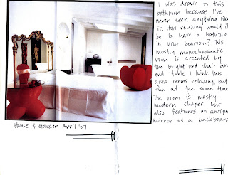
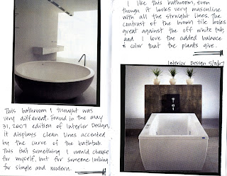
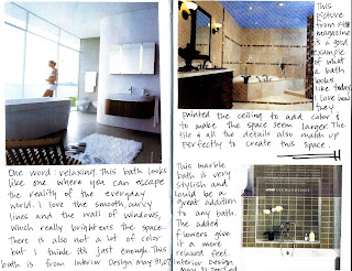
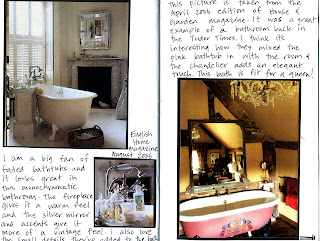
So our assignment here was to focus on composition. Thumbing through magazines there are a lot of different layouts and ideas to choose from. I chose to focus on bathroom design because it's different and there are so many variations seen across the board. I enjoyed finding the photographs and wishing that I had a bathroom like some of these! If I had to do anything differently I would have taken more time as far as putting the zine together and I would have typed the text, which I think would have made "Coming Clean" look a lot more clean! Overall, I am satisfied with my product...stay tuned for the 2nd edition!


Thursday, October 4, 2007
Studio Layout!

 This is my studio layout, which I love how it turned out! So what is studio anyway? To me studio is made up of so many things...late nights, junk food, energy drinks, LACK OF SLEEP, we're all in it together! Ideas, PROJECTS, glue, markers, exacto knives, mat board, our own workspace, friends, music, the list goes on and on! When I saw the original layout I thought it was a great way to display ideas and that I could use this layout to compile all of my feelings on what studio is, and that it wouldn't necessarily have to be in an organized way...because we all know studio isn't always that organized! =)
Tuesday, October 2, 2007
Strong & Lovable...Memory Box
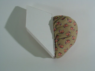
So here it is, I actually love the final product! I used white mat board for the exterior and chose to use spikes to show the rigidity of Nanny, and then in the inside I used a soft, red material as well as polyester fill to make the inside soft. I like the red because it shows love and contrasts the white nicely. I also used one spike to create a latch for the box itself so that, when closed you see only the white spike exterior and then when you open the box (like Nanny's personality) you see the loving, nurturing, giving side. I like how this turned out because I feel it shows who she is in an abstract way. If I had the chance to do it over I would focus more on my craftsmanship but other than that I'm happy!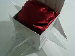
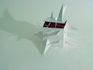
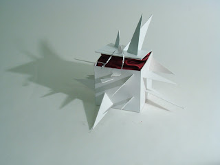
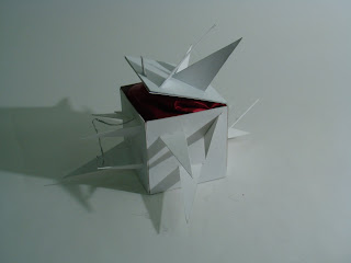
This is my 2nd iteration and really tried to show the stubborn/strong willed/strict side as well as the lovable side..so here it is! I used white mat board for the s/s/s if you will, and the other side is made of soft material and polyester filling, so its soft to the touch. I liked this one okay, but wasn't very happy with the shape itself, so I decided to do something a little more abstract which brings me to ....ta da..my final project....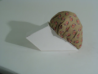
 So the next thing I did was came up with words that described my grandma. She was a great lady, and there were so many things that I wanted to say about her but I had to narrow it down...so I chose to show the stubborn, strong willed, strict side of her, as well as the lovable, gentle, nurturing side that I love and remember so well. Nanny was a great friend, grandma, mother etc. but was a little rough around the edges. If she didn't know you she might come off a little unfriendly, but once you got to know her she would show her soft side. That leads me to my 2nd iteration.
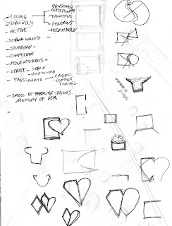
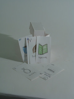
Assignment: Create a container that holds a memory..hmm...hold a memory? How the hell do you do that? Well I narrowed down my memory to my grandma and went from there. The following is my parti and my first iteration. At first I brainstormed and came up with all the things that remind me of her....coffee, football, shopping are just a few...and she a was a huge card player. So my first idea was to create a card box that held cards , each card having something that reminded me of her. I also had the idea to create a card box and inside have pieces that remind me of her. After the first iterations I felt like I was showing what she liked, but not really showing who Nanny was. The next step, who was Nanny anyway?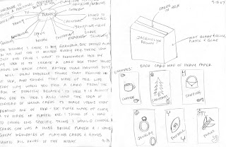


This is my 2nd iteration and really tried to show the stubborn/strong willed/strict side as well as the lovable side..so here it is! I used white mat board for the s/s/s if you will, and the other side is made of soft material and polyester filling, so its soft to the touch. I liked this one okay, but wasn't very happy with the shape itself, so I decided to do something a little more abstract which brings me to ....ta da..my final project....

 So the next thing I did was came up with words that described my grandma. She was a great lady, and there were so many things that I wanted to say about her but I had to narrow it down...so I chose to show the stubborn, strong willed, strict side of her, as well as the lovable, gentle, nurturing side that I love and remember so well. Nanny was a great friend, grandma, mother etc. but was a little rough around the edges. If she didn't know you she might come off a little unfriendly, but once you got to know her she would show her soft side. That leads me to my 2nd iteration.
Assignment: Create a container that holds a memory..hmm...hold a memory? How the hell do you do that? Well I narrowed down my memory to my grandma and went from there. The following is my parti and my first iteration. At first I brainstormed and came up with all the things that remind me of her....coffee, football, shopping are just a few...and she a was a huge card player. So my first idea was to create a card box that held cards , each card having something that reminded me of her. I also had the idea to create a card box and inside have pieces that remind me of her. After the first iterations I felt like I was showing what she liked, but not really showing who Nanny was. The next step, who was Nanny anyway?


Tuesday, September 25, 2007
The Scary Side of Me
 I actually enjoyed this assignment! We had to turn off all the lights, sit in front of a mirror and shine a light on one part of our face. Then we had to use white colored pencil on black paper to draw what we saw. It was quite a challenge and almost a different way of thinking because we have been using pencil or pen or white paper up until this point. Even though this looks like something from a horror film I think I got the point of the assignment...thinking outside the box!
Subscribe to:
Posts (Atom)