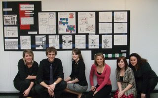

Tada! After lots of blood, sweat and tears we finally made it! It was hard work but overall I think were are all happy with the outcome and learned a lot!
Working together on our board
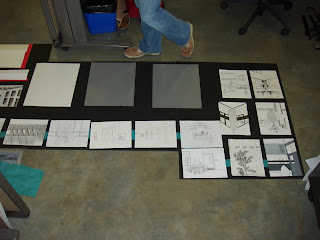
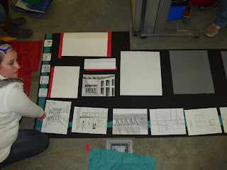
We chose to use a black background to help our images pop out, and used red, blue and green to accent which were the colors we used in our diagrams. We felt that the diagrams were very important so we situated them at the top and middle of the presentation. We also used strips of paper to create a band throughout all 3 boards to tie them all together.
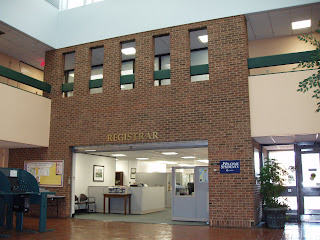
interior shots of Mossman
For this assignment we were put into groups and given a building to research, draw, create diagrams to better understand the building, and create presentation boards with all of our information. The building we were assigned was Mossman. The building has a "brutalist" design, meaning it isn't very user friendly and not welcoming to people. However, this building is where student activities, the cashier and registrars offices are, as well as the chancellor's office. Our group had a hard time finding interesting images to draw, but once we arranged all of the info we had we were pleased with the outcome and learned that WORKING IN GROUPS IS NOT AS EASY AS WE ALL THOUGHT!!
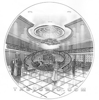
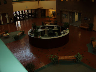
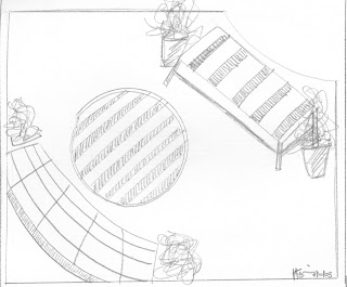
I love the way they used circles to create the border for this drawing! In Mossman the information desk is circular so I figured this style would work good for my drawing....this is the view from the 2nd floor.
So the above drawing is much more detailed but I enjoyed working within the circle...who know maybe my next thumbnails will be circles??
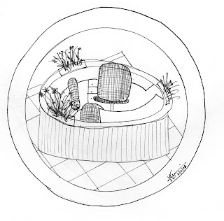
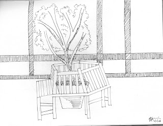
I was drawn to this style because I think it's fun and the drawing gets the point across without having to be "perfect." It's also interesting that some of the lines look straight and others you can tell were free handed, so I decided to mix and match like they did....
This view is of a couple of benches, a table and a few plants from the 2nd floor. I think I should have even gone messier than I did but I enjoyed this drawing and I like how the artist illustrates the plants, it's fun!
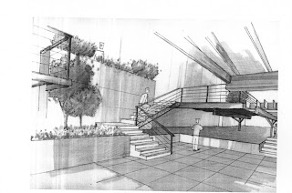
www.geocities.com/roberts_asai/pooldeckpers.html I chose this drawing because I thought it was very refined and stylized with the straight lines, and the plants and trees make it a little easier on the eyes.
I tried to make the doors and bench very straight forward like the drawing and then used the same method on the tree to mimic the drawing as well.


 Tada! After lots of blood, sweat and tears we finally made it! It was hard work but overall I think were are all happy with the outcome and learned a lot!
 Working together on our board
 interior shots of Mossman
 I love the way they used circles to create the border for this drawing! In Mossman the information desk is circular so I figured this style would work good for my drawing....this is the view from the 2nd floor.
 So the above drawing is much more detailed but I enjoyed working within the circle...who know maybe my next thumbnails will be circles??
 I was drawn to this style because I think it's fun and the drawing gets the point across without having to be "perfect." It's also interesting that some of the lines look straight and others you can tell were free handed, so I decided to mix and match like they did....
 This view is of a couple of benches, a table and a few plants from the 2nd floor. I think I should have even gone messier than I did but I enjoyed this drawing and I like how the artist illustrates the plants, it's fun!
 www.geocities.com/roberts_asai/pooldeckpers.html I chose this drawing because I thought it was very refined and stylized with the straight lines, and the plants and trees make it a little easier on the eyes.
 I tried to make the doors and bench very straight forward like the drawing and then used the same method on the tree to mimic the drawing as well.


